germanname1990
 I am the King of Live Play. Wheel with it!
Posts: 2,583  SPIN ID: WG1096336
|
Post by germanname1990 on Jul 25, 2009 14:17:17 GMT -5
Well, thank you, downsa530, although I did all these put on this forum so far, but please, if you have any art, please feel free to put it here. I'm looking forward to seeing them.
And, Myles! You're here too! Wonderful, and thank you for the compliment on the Merv drawing!
|
|
germanname1990
 I am the King of Live Play. Wheel with it!
Posts: 2,583  SPIN ID: WG1096336
|
Post by germanname1990 on Apr 20, 2011 21:59:44 GMT -5
Did I read someone say contestant backdrops? Now most of these were done back in 2007 unless noted, so they're a bit out of date here. 1975: (I made the display color-coded because of the Milton Bradley version, although I heard when the show premiered, they were white) 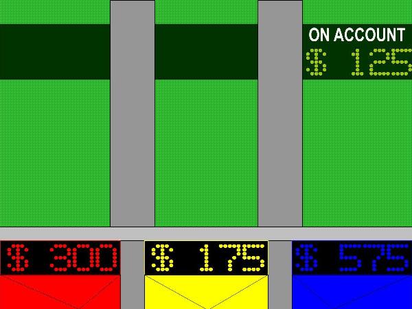 1976: They're now white and will stay that way until 2002.  1978: Six characters can fit inside now instead of five. I don't know about the On Account, however, but I believe it stayed at five. 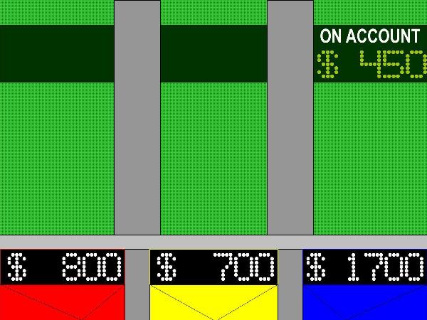 1980: Sunbursts replace the green disco backdrops. 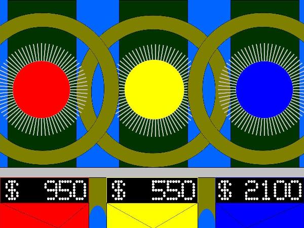 1985: About 1984 or 1985, the rays' looks change a bit. 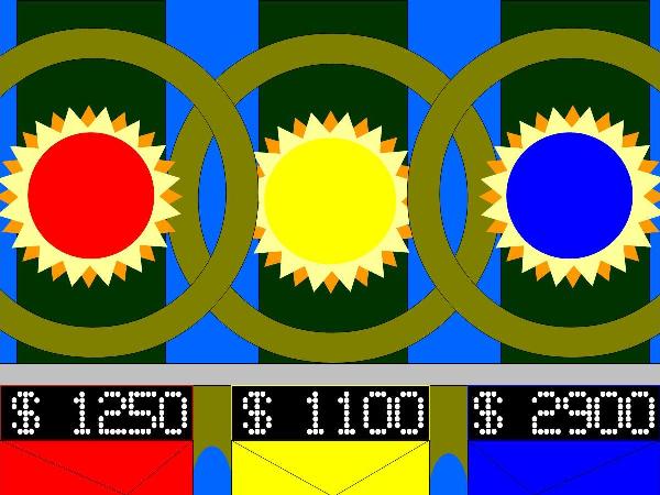 1987: By 1987, the rays widen significantly. 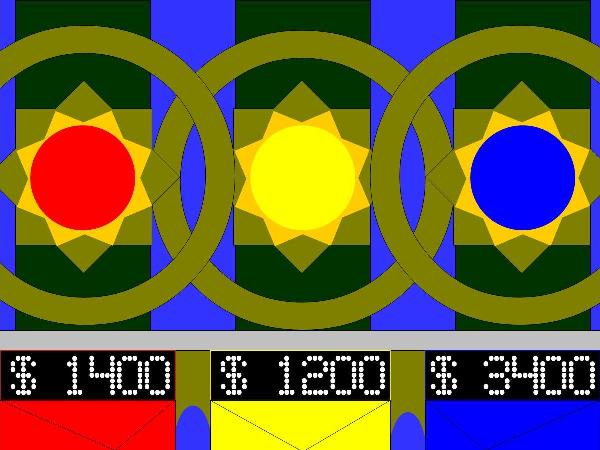 1989: After moving from NBC to CBS, the theme is jazzed up and the sunbursts change to shieldy chevrons. 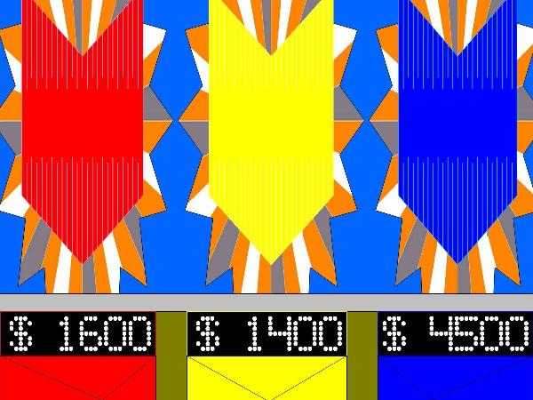 1990: Although these premiered when Wheel went to New York in 1988, these diamond-shaped backdrops were used on the show's default set in 1990 if not 1991. 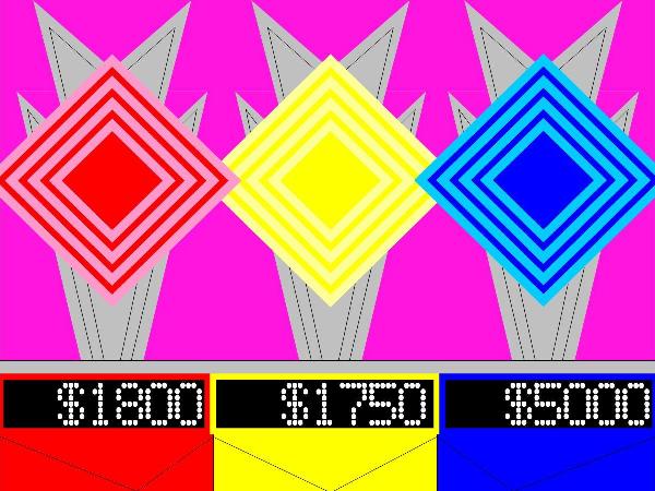 1992: These fireworks loaded with W's for Wheel debut in September 1992 for the show's 10th syndicated season. Note I dated them as 1993 over at DA. 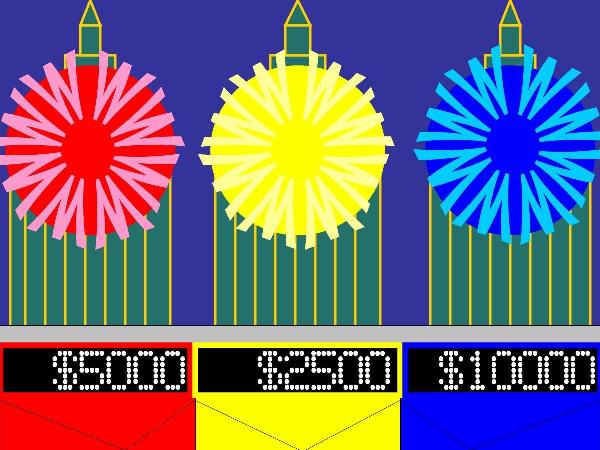 1995 (Hawaii): Obviously, this one's rather crude and came out of my memory before Hawaiian episodes from this time were uploaded to YouTube. 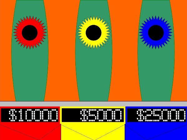 1996 (Atlanta): For the 1996 Summer Olympics, these torch-shaped backdrops were designed to commemorate this special occasion. Note this was done in late 2008. 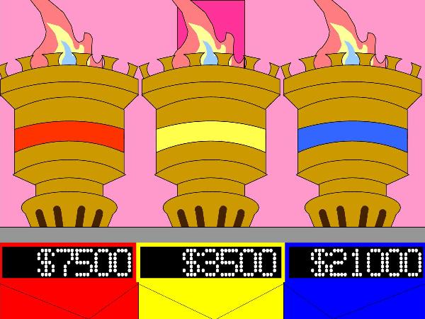 2003: I did not made the podiums for 2002, just went ahead to late 2003. 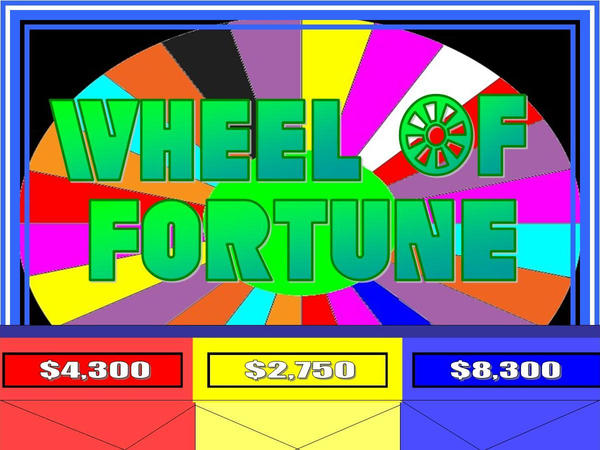 2007: I made these in 2008 as a request from someone over at Fanart Central. 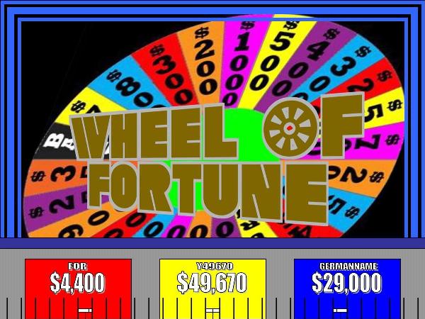 I also made the Polish Wheel backdrops from 1992, though it's not at DeviantArt like I thought it was. 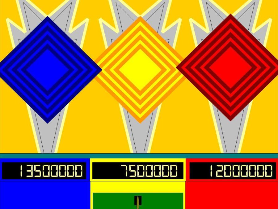 Again, I did these a while back, so please understand. I'll take positive criticism unless it's reiterated numerous times. That will become negative criticism eventually. And of course, please no rude criticism either. I don't put up with that, and I'm certain no one else here does either. Finally, in case you're wondering why the blue podiums have a higher score than the others, it's because blue is my favorite color as it's the color of Sonic The Hedgehog (yes, The has a captial T as it's his nickname). Moved images around in post in order to restore normal margin size. This post has otherwise not been modified. -cu |
|
|
|
Post by woffan4ever on Apr 22, 2011 8:15:23 GMT -5
My turn! These are actually the first graphics I've ever made, so they might be a little rough. I have now fallen in love with PowerPoint, actually thanks to MarioGS and my college Microsoft Office Class... Here's a Toss-up:  The Contestant Podium:  Puzzle Board (from Round 1)  The only problem I have is getting all of the blank letter spaces on the board to look even as well as my letters. Any suggestions? |
|
|
|
Post by pricemodel1997 on Apr 22, 2011 21:20:34 GMT -5
My turn! These are actually the first graphics I've ever made, so they might be a little rough. I have now fallen in love with PowerPoint, actually thanks to MarioGS and my college Microsoft Office Class... Here's a Toss-up: see op The Contestant Podium: see op Puzzle Board (from Round 1) see op The only problem I have is getting all of the blank letter spaces on the board to look even as well as my letters. Any suggestions? Theese look very nice though i wonder what your version of the sunbursts would look like |
|
|
|
Post by woffan4ever on Apr 23, 2011 6:40:49 GMT -5
My turn! These are actually the first graphics I've ever made, so they might be a little rough. I have now fallen in love with PowerPoint, actually thanks to MarioGS and my college Microsoft Office Class... Here's a Toss-up: see op The Contestant Podium: see op Puzzle Board (from Round 1) see op The only problem I have is getting all of the blank letter spaces on the board to look even as well as my letters. Any suggestions? Theese look very nice though i wonder what your version of the sunbursts would look like Thank you, pricemodel. As far as sunburts go, I'm not that experienced enough to do make those. I might with more practice, though.... |
|
|
|
Post by pricemodel1997 on Apr 23, 2011 8:15:49 GMT -5
Thank you, pricemodel. As far as sunburts go, I'm not that experienced enough to do make those. I might with more practice, though.... Well you can always practice and start at 81 the rays are simple there Fixed maligned quote. |
|
realdeo
BANHAMMER'D
Me and Banville Forever
Posts: 0
|
Post by realdeo on May 3, 2011 4:00:50 GMT -5
Anybody has a wheel with nothing ( Just borders of each wedges , I want to print it ) You can get the credit ---THE FOLLOWING ORIGINALLY POSTED BY MARIOGS--- Here you go. i52.tinypic.com/2ahio95.pngLarge image converted to link. |
|
|
|
Post by woffan4ever on May 3, 2011 10:58:58 GMT -5
I have a request, if this is possible. I have been trying to use the wedges provided here to make a wheel of my own to use for my netgames, but, alas, to no avail. I just can't get all the wedges turned the right way. What I am wanting is a wheel where I can zoom in on the contestant's area (i.e. if it's Player 1's turn, zoom in on his/her spot). Like Mario had in his netgame here. I am wanting the current Season 28 wheel configs. Could anyone do that for me? I would really appreciate it!
I can do the puzzle boards for anyone who might like to have one. My best work, I feel is the one I posted a pic of before, but I'm willing to try my hand at the 83-96 board or 97-03 board. Just putting that out there for anyone who might want one.
|
|
MarioGS
Made It and Played It VIP  PhD in Wheeloffortunology
Posts: 14,931  Airdate: 03/25/2016
Winnings: $76,086
SPIN ID: RS1363545
|
Post by MarioGS on May 3, 2011 11:10:56 GMT -5
I have a request, if this is possible. I have been trying to use the wedges provided here to make a wheel of my own to use for my netgames, but, alas, to no avail. I just can't get all the wedges turned the right way. What I am wanting is a wheel where I can zoom in on the contestant's area (i.e. if it's Player 1's turn, zoom in on his/her spot). Like Mario had in his netgame here. I am wanting the current Season 28 wheel configs. Could anyone do that for me? I would really appreciate it! You mean something like these?    These are the versions I used in my netgame, based on the current set. |
|
|
|
Post by woffan4ever on May 3, 2011 15:55:06 GMT -5
OK.....so I'm still having the SAME problem. I can't for the life of me get the wedges rotated the right way! They either want to overlap each other OR there's a big gap at the top and they're not the same size! HELP!! please, if anyone can. I'm giving myself a headache over this....
|
|
MarioGS
Made It and Played It VIP  PhD in Wheeloffortunology
Posts: 14,931  Airdate: 03/25/2016
Winnings: $76,086
SPIN ID: RS1363545
|
Post by MarioGS on May 3, 2011 17:30:32 GMT -5
OK.....so I'm still having the SAME problem. I can't for the life of me get the wedges rotated the right way! They either want to overlap each other OR there's a big gap at the top and they're not the same size! HELP!! please, if anyone can. I'm giving myself a headache over this.... Here are some tips: hold down the Shift key while rotating to rotate in increments of 15 degrees, the exact amount for a wheel wedge. To move wedges to just the right spot, hold down the Control key while pressing the arrow keys to move objects by the pixel. If the rotations don't match up with the pegs, right click the wedge and click "Size and Position," then change the number of the degrees in the rotation box. Make sure each wedge is rotated exactly 15 degrees more (or less) than the one next to it. |
|
|
|
Post by woffan4ever on May 3, 2011 17:41:49 GMT -5
Ahhhh.....that makes sense!! I was just using the rotation handle and the top of each wedge and doing it freehand.....thanks, Mario!
|
|
|
|
Post by woffan4ever on May 3, 2011 18:10:50 GMT -5
Ok....this is how far I've gotten....  But, farther down the wheel I go, each wedge keeps getting a bigger gap up top. Am I doing something wrong? I understand how to rotate and do the move by pixel. Are my wedges not shaped right at the top? I'm using wheelgenius's wedges. |
|
therealcu2010
Executive Producer  Head of the Table
Acknowledge Me!
Posts: 4,552  SPIN ID: JH9373772
|
Post by therealcu2010 on May 3, 2011 18:26:02 GMT -5
The wedges are a bit too small for that wheel. Each wedge should span a total of four pegs, for three "spaces", so to say (for the MDW, each "Bankrupt" and the million are between two pegs each). Try enlarging the wedges so that they take up three spaces each, and they should then match up with the edge of the wheel. I'll share what I have so far- the set I'm working on is a sort of "hybrid" between the current set and the old ones. Puzzleboard:  Contestant area:  (I hate the new score displays...they're so boring...) I haven't started on a wheel yet (mostly because I'm still coming up with a configuration-again, I intend to do a hybrid of the current one and the older ones), but I don't have the correct font (I have Clarendon, which is close but not quite right), and haven't taken the time to sit down and actually work on it yet. |
|
|
|
Post by woffan4ever on May 3, 2011 20:18:20 GMT -5
Ah-ha!! I think I have it!! What do you guys think?  Anything I can change, work on, do better on? |
|
MarioGS
Made It and Played It VIP  PhD in Wheeloffortunology
Posts: 14,931  Airdate: 03/25/2016
Winnings: $76,086
SPIN ID: RS1363545
|
Post by MarioGS on May 3, 2011 20:22:01 GMT -5
Pretty nice job!  Just resize the wheel a bit more to match up with the pegs better. |
|
|
|
Post by Deleted on May 3, 2011 20:24:08 GMT -5
I love it! I can't wait to spin it in your next mock game! ;D  ;D |
|
|
|
Post by woffan4ever on May 6, 2011 0:11:16 GMT -5
Ya know, I think I just might be getting the hang of this wheel making thing..... ;D  What do you guys think? |
|
|
|
Post by Deleted on May 6, 2011 0:14:19 GMT -5
I think that I better not land on Bankrupt!  About the wheel, I think it's terrific! Love it.  |
|
|
|
Post by jonsea31 on May 6, 2011 7:56:52 GMT -5
Is there any way that somebody could create an image of the 1990s Bonus Round prize display? The one where the contestant chooses from the letters W, H, E, E, and L? Thanks in advance!
|
|